DESIGN BRIEF
Objective:
Exhibition Poster for the Animal Imagery in Contemporary Art exhibition.
Client:
Bendigo City Gallery, Ballarart City Gallery & Wollongong City Gallery.
Target/audience: General public
Requirements:
Poster must be 1A in size. Full colour. Vector Graphics
Copy
Animal Imagery in Contemporary Art [main title]
Bendigo City Gallery 14 December – 4 February 2017
Ballarat City Gallery 17 February – 25 March 2017
Wollongong City Gallery 27 April – 27 May 2017
PROCESS & what I've learnt
After getting the brief and learning the basic tools I would need to create the poster on illustrator, I began a long process of experimentation and playing around with different images and techniques to try and find an idea that I thought matched the brief well.
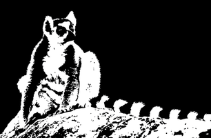
I began with an image I found online of a lemur. I used image trace to create a black and white version and played around with the levels to try and find an image I was happy with and ended up with this. Although I found this technique interesting and liked the look of the final product, I decided against using in in my poster as I thought the tail was not standing out as much as I would have liked and I no longer thought the positioning of the lemur would work.
I began with an image I found online of a lemur. I used image trace to create a black and white version and played around with the levels to try and find an image I was happy with and ended up with this. Although I found this technique interesting and liked the look of the final product, I decided against using in in my poster as I thought the tail was not standing out as much as I would have liked and I no longer thought the positioning of the lemur would work.
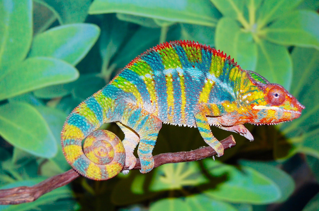
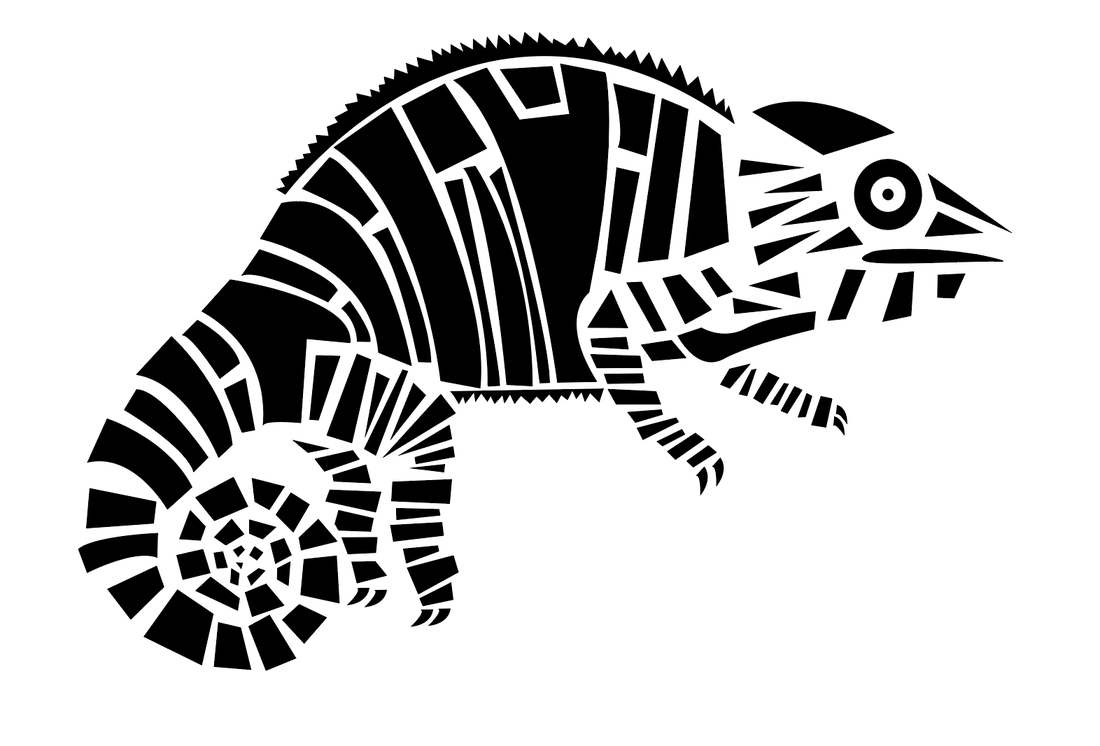
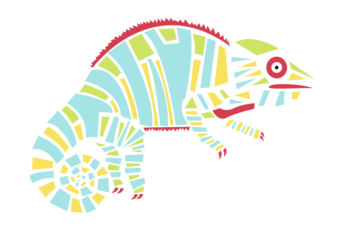
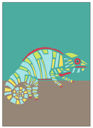
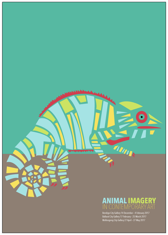
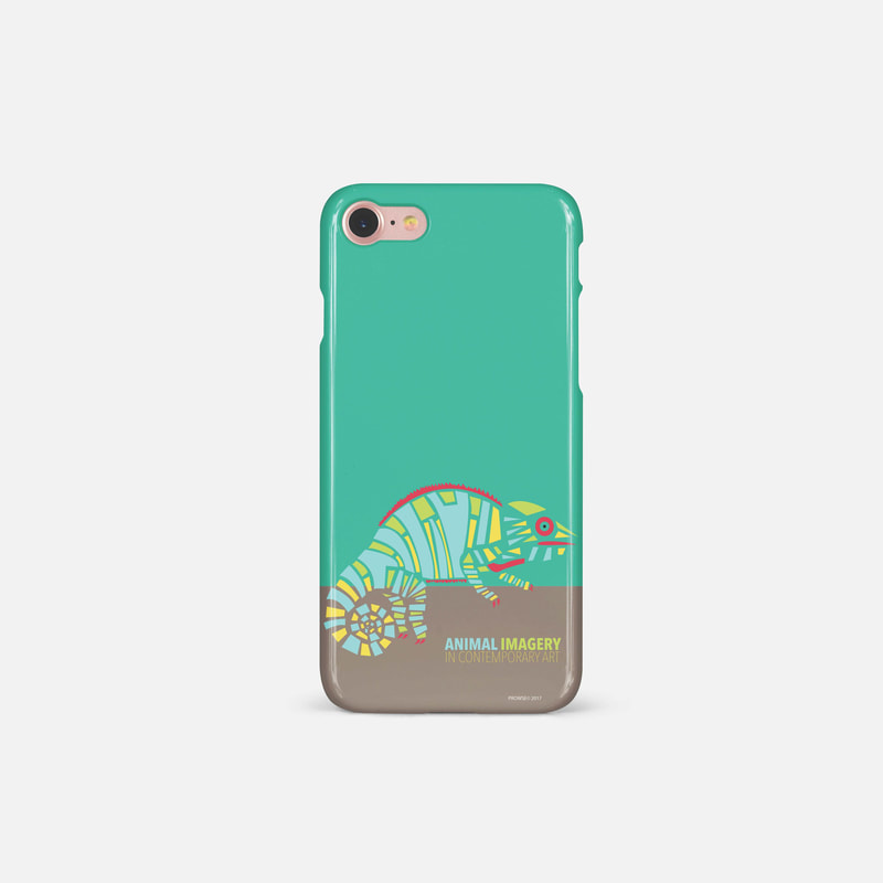
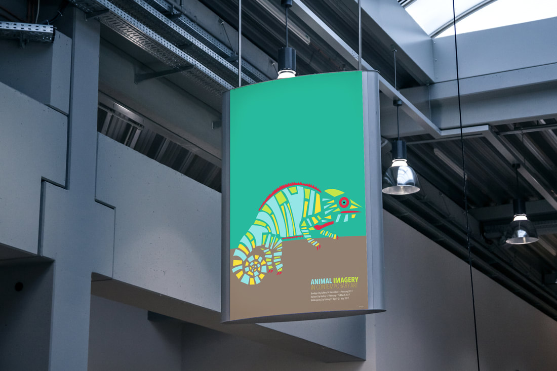
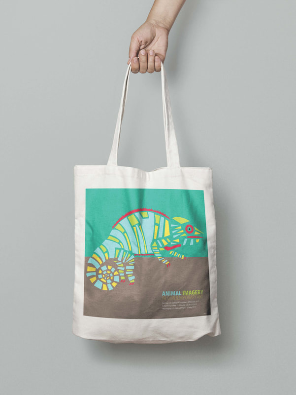
After setting aside my first idea I went online searching for animals that I could deconstruct and simplify. I had played around with creating shapes with the pen tool in illustrator and thought it would create an interesting effect. I eventually found a photo of a panther chameleon and a played around for a couple of days working out how I could simplify it. I started off with outlines but that didn't show off the chameleon’s colour and form as much as I wanted to so I went back to my idea of using shapes. After positive feedback on the illustration I worked on the colours to create the right amount of contrast and to create a more contemporary feel to match the brief. The image was simply yet playful which would appeal to a wide audience as the poster is meant for the general public.
|
|
|
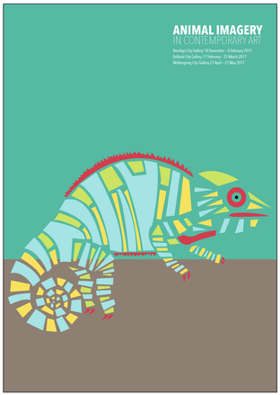
With the main illustration finished I started experimenting with different background colours that would make the illustration stand out. I started working with different beige and cream colours that did match the chameleon, but were ultimately a bit boring and didn't catch your eye. After advice from Gregor, I decided to have two background colours that met in the bottom third. This created a nice ledge for the chameleon to sit on and kept it in a good focus point. I darkened the origical base to create a more fawny brown as the bottom colour, and decided on a blue/green for the top, to complement the colours of the chameleon. These colours both looked great with the red as it made it pop and stand out from the rest of the page and added a lot more interest to the design. I found the type the hardest part of the design process as I have not had any previous experience with font. I began with all the the text on the page being to large and in fonts that took away from the illustration. After playing around with fonts for quite some time I settled on Avenir Next Condensed. I ended up using 3 different thicknesses to create highereichy in the text and to seperate the different sections. My increasing the size of 'ANIMAL IMAGERY' compared to 'IN CONTEMPORARY ART' the two lines were evenly spaced and took up the same line length. I ended up using sizes 79, 70 and 27 for the text as after doing print tests in A4 and A3, i decided they would work best and be the right size for the final A1 poster.
|
|
Doing the test prints also made me take a closer look at the overall design and colour of the poster. I played around more to make the background colour complement the chameleon more so the whole image was brighter, I also changed the positioning and colours of the text to make the poster more impactful. In A1 size the large uncluttered space in the green/blue area leads the eye down to the illustration and gives it a more dramatic feel. With these changes finalised I was left with my finished design that I believe fits all aspects of the brief. I learnt a lot of new techniques on illustrator and with poster design throughout the process.
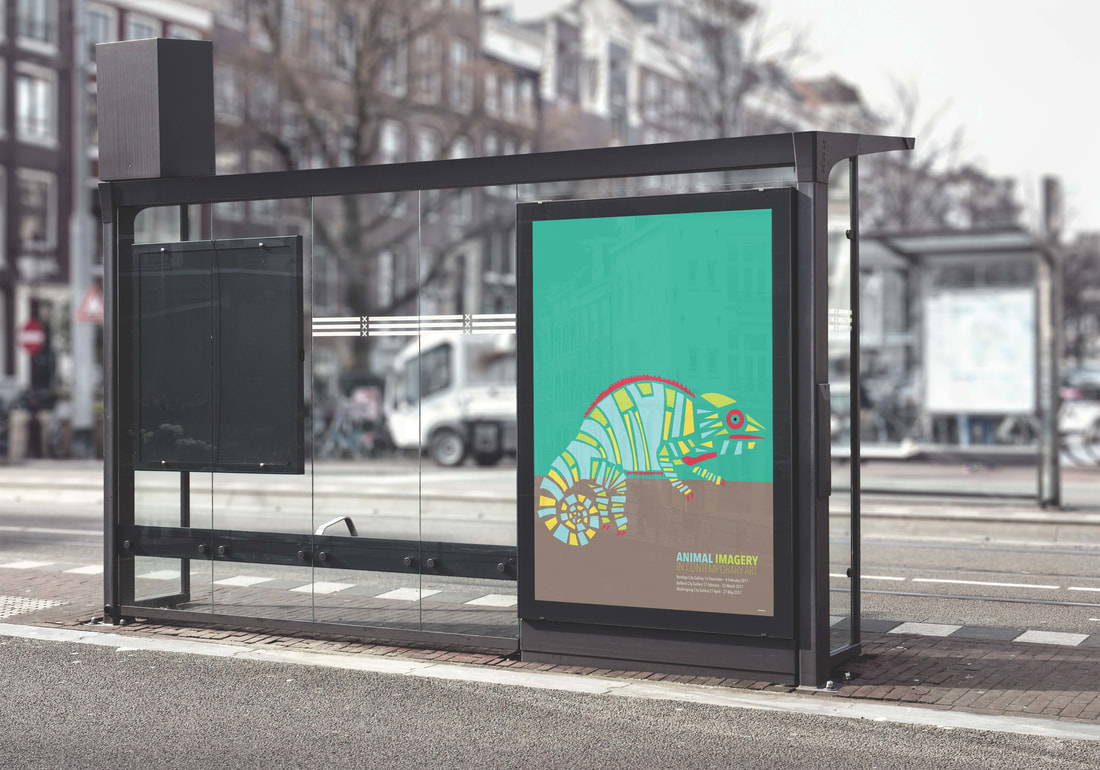
PUBLICITY COLLATERAL
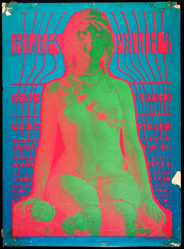
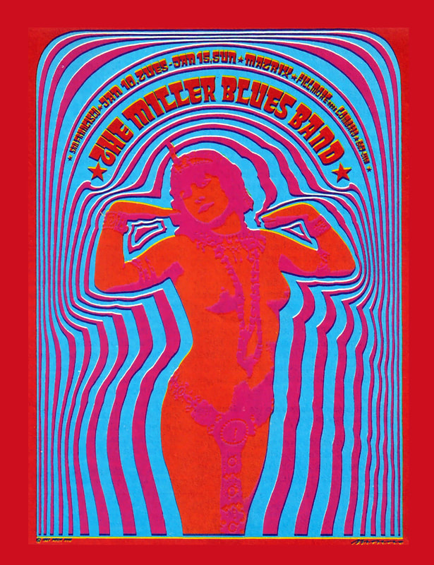
VICTOR MOSCOSO
1967
1967
1967
|
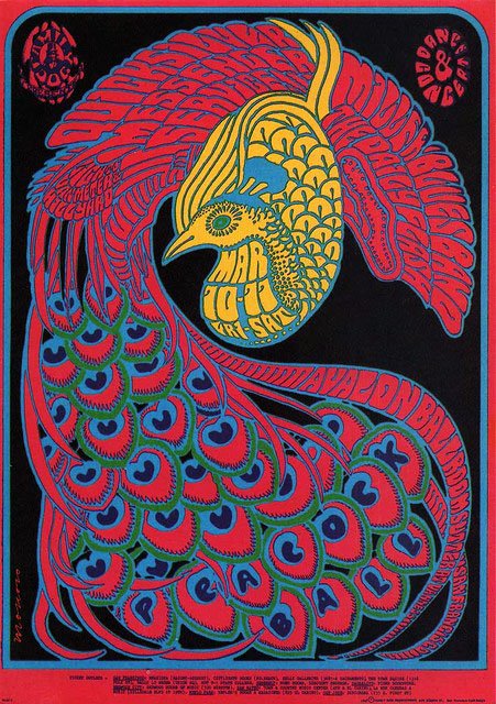
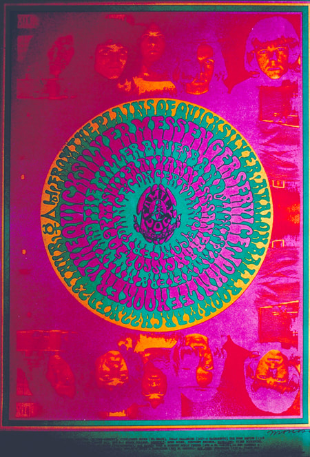
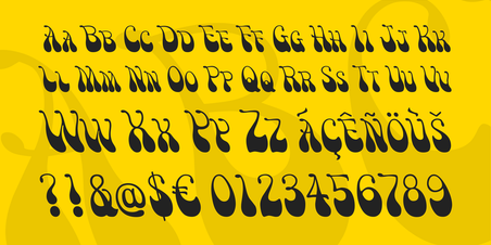
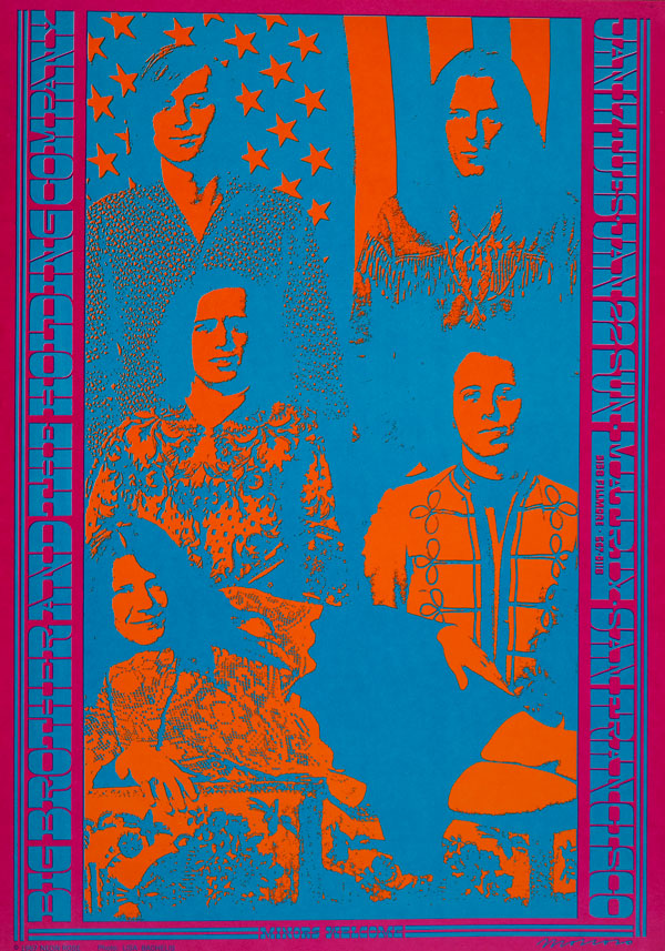
Victor Moscoso is a Spanish-American artist that was one of the first psychedelic poster artists who had been formally trained. He became one of the most respected and sort after poster artists, emerging during the 1960’s. He is best known for creating psychedelic rock posters, advertisements, and underground comixs throughout the 60’s and 70’s in San Francisco. Moscoso was born in 1936 in Galicia, Spain, three and a half years later his family moved to Brooklyn and after studying at Cooper Union and Yale University, in 1959 he moved to San Francisco, where he studied at the San Francisco Art Institute. There, after seven years of art school, he eventually became an art instructor. Moscoso’s training with painter Josef Albers at Yale university, greatly influenced Moscoso, especially during 1966 when he started producing chromatically electric posters for the Grateful Dead, the Doors and other bands (Johnson, 2015). In an interview with Gary Groth in 2011 Moscoso states ‘From that point on, what I had learned from Josef Albers came into play, because when I reversed all the rules and I really knew the rules. The better you know the rule, the better you can break it.’. It was through this realisation that Moscoso began creating such phenomenal psychedelic posters, and his popularity grew. So, after many years of his life spent studying and teaching art and colour theory, he essentially turned the information on its head to create his artworks. Moscoso started his own company, Neon Rose, in 1966. Starting the company allowed him to have whole control of the posters in the series, which ended up being some of the most iconic posters and images the psychedelic era. Moscoso’s fonts were mostly all created by hand and have inspire a font called ‘Victor Moscoso’ (Shown below).
|
1967
1968
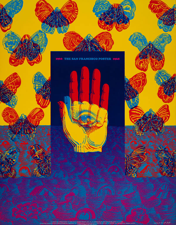
1966
|
REFERENCES
Groth, G 2011, ‘An Interveiw with Victor Moscoso’, The Comics Journal, 246, viewed 29 August 17, <http://www.tcj.com/an-interview-with-victor-moscoso/>
Johnson, K 2015, ‘Psychedelic Drawings, 1967-1982’, The New York Times, viewed 28 August 2017, < https://www.nytimes.com/2015/03/20/arts/design/victor-moscoso-psychedelic-drawings-1967-1982.html?mcubz=3>
Transpersonalspirit, 2017, Psychedelic Poster Art: Victor Moscoso, August 17 <https://transpersonalspirit.wordpress.com/2012/11/10/psychedelic-poster-art-victor-moscoso/>
